Even some Alice Cooper fans can be confused about the difference between the group and the solo artist.
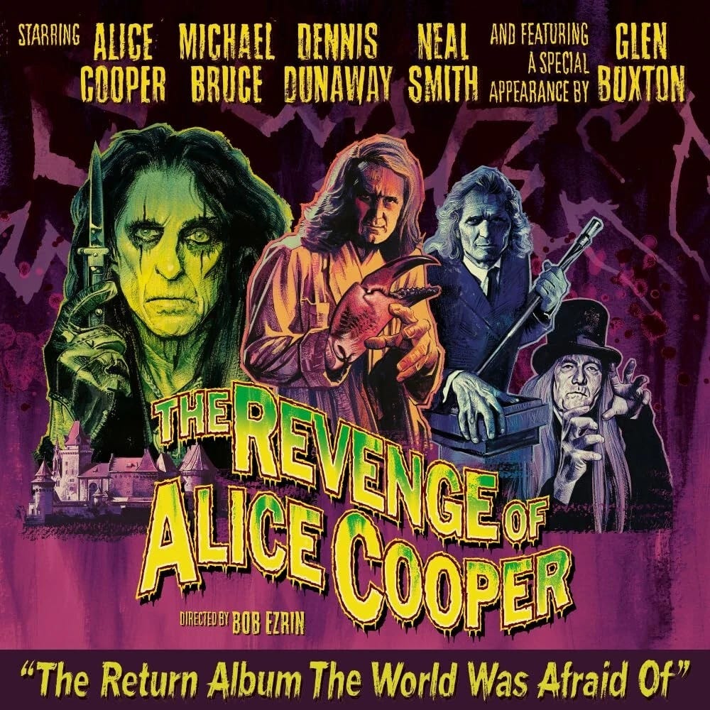
Once upon a time, in the late 1960s and early 1970s, Alice Cooper was a band, consisting of a lead singer named Alice Cooper (nee Vincent Furnier), guitarists Michael Bruce and Glen Buxton, bassist Dennis Dunaway, and drummer Neal Smith.
In 1974, after seven albums, for reasons that differ depending on who’s telling the tale, the band members went their separate ways. Alice Cooper, the lead singer, became a solo act. The other four found a new lead singer and attempted to continue as the Billion Dollar Babies (named for the AC group’s highest-charting album), but success eluded them. Buxton died far too young at age 49 in 1997.
Over the past fifty years, Cooper has maintained a core base of fans drawn to the power of the original group’s music (and his solo hits) and a macabre, theatrical stage show.
Even long-time fans sometimes refer to Bruce, Buxton, Dunaway, and Smith as Cooper’s backing band, but this is inaccurate. Originally, all five members were Alice Cooper.
At various points, the four surviving members have reunited for one-offs (Live from the Astroturf is a highlight) and occasional songs on Cooper’s solo releases. But they’ve never made an album-length return.
Until now.
The Revenge of Alice Cooper is like stepping into an aural time machine and traveling back to 1974 for the band’s follow-up to Muscle of Love. Sure, there’s nothing here that’s as anthemic as “I’m Eighteen” and “School’s Out,” or even “Elected” and “Under My Wheels.” But such comparisons are unfair. Those songs have had decades of airplay to burn into fans’ collective memories, tied to rites of passage and idealized memories of youth.
By contrast, chances are good that the songs on The Revenge of Alice Cooper will seldom be played on the radio, which is more a commentary on the sad state of that industry than on the quality of the songs here.
Because, make no mistake, the new album is excellent.
The record opens with “Black Mamba,” a quintessential Alice Cooper tune, filled with self-awareness and double-entendre. Just what is the black mamba, anyway? A literal snake “inside your bed sheets / Coiled into the folds so white”? A trouser snake (hee hee)? Both? Neither? The song is wrapped in the groovy, guitar-driven sound fans are accustomed to hearing from the group, making it the perfect introduction.
Some of the songs try too hard to be menacing and hip, serving only to remind audiences that the median age of the members is late 70s. “Wild Ones” suffers this way, but not as much as “Up All Night,” which would be right at home on any glam metal album from the ’80s. And “Kill the Flies” maps too-familiar territory for the band, another song about institutionalization and mental illness, topics that don’t play well in today’s more enlightened climate.
The songs get better with “One Night Stand,” a clever opus about two serial killers unwittingly attracted to one another. “Blood on the Sun,” composed by Dunaway, is the album’s best, reflecting on the senselessness of war and its proclivity for chewing up our youngest and best.
A surviving guitar part by Buxton highlights “What Happened to You,” ensuring that all members of the original band are represented. Elsewhere, lead guitar parts are handled by Gyasi Heus, a name I was unfamiliar with but whose work blends in well with the veteran members. Robby Krieger of The Doors plays on “Black Mamba.”
Cooper’s harmonica is a focal point on “Intergalactic Vagabond Blues” and “I Ain’t Done Wrong,” the latter being a cover of a Yardbirds song.
Unlike some of his contemporaries who have soldiered on into their later years, Cooper’s voice has aged perfectly. His raspy delivery is indistinguishable from his heyday, and he still sings with conviction. The decision to pepper the chorus of “Black Mamba” with “Ya ya ya,” however, is perplexing, as if a more appropriate lyric escaped him.
Presiding over the entire affair is long-time AC producer Bob Ezrin, who also helps with background vocals and plays the organ on “Kill the Flies.”
The regular album’s final song, “See You on the Other Side,” (two bonus tracks follow on some editions), would be the perfect career coda; however, at 77, Cooper has shared no plans to retire or even slow his incessant touring. An alternate explanation for the title is that fans will just flip the record over and listen again.
So, will Cooper’s touring band play any of this album on the road this summer and fall? Performing these songs without the original group feels wrong, yet the material deserves a live presentation. Bruce, Dunaway, and Smith will join Alice for his annual Christmas Pudding show in Arizona later this year, yet the logistics of them playing a regular schedule are likely more challenging. Let’s hope something can be worked out and that any such performances will be professionally recorded for posterity.
It’s not often that a band writes a new chapter after 52 years, and even less likely that it’s any good. The original Alice Cooper—the group, that is—has managed to do both.


.webp)


.jpeg)
.jpeg)
.jpeg)
.jpeg)


